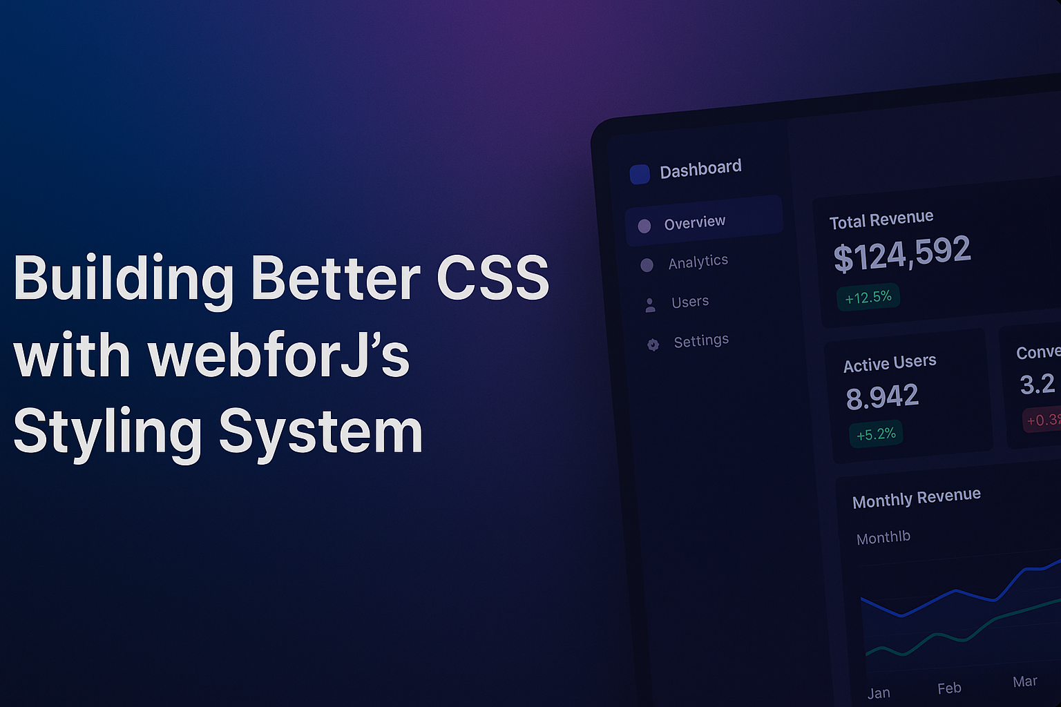
Building Better CSS with webforJ's Styling System

I've spent the better part of a year building webforJ demos and documentation, and honestly, it's taught me that I knew a lot less about CSS than I thought. I thought I knew enough to get by, some selectors, basic properties, maybe a flexbox here and there. Turns out there's a difference between writing CSS that works and writing CSS that actually makes sense.
Working on webforJ's styling system has changed how I approach CSS. It handles common tasks well and gets out of your way for the interesting parts. Plus, I no longer spend half my time wondering why my styles disappeared into the void.
CSS that loads when it should
The first thing that caught my attention was how stylesheets load in webforJ. Instead of complex workarounds, you get annotations that actually work the way you'd expect:
@StyleSheet("ws://app.css")
@StyleSheet("ws://dashboard.css")
@AppTheme("light")
public class Application extends App {
    // Your app logic here
}
The ws:// prefix maps directly to resources/static. webforJ deduplicates automatically - reference the same CSS file from multiple components and it still only loads once. You can annotate at the app level or component level, and everything loads exactly when needed.
Inline styles that scale
I avoided @InlineStyleSheet initially. Inline styles felt wrong because of separation of concerns and all that. But working on component demos changed my perspective.
@InlineStyleSheet("""
  .example-card {
    background: var(--dwc-surface-2);
    padding: var(--dwc-space-l);
    border-left: 4px solid var(--dwc-color-primary-40);
    transition: all 0.3s ease;
  }

  .example-card:hover {
    transform: translateY(-2px);
  }
""")
@Route
public class CardExample extends Composite<Div> {
    public CardExample(String content) {
        getBoundComponent().addClassName("example-card");
        getBoundComponent().setText(content);
    }
}
When I need to change something, it's all right there. No more digging through random CSS files trying to figure out where .some-random-class is defined. Everything just lives together, which makes way more sense than I expected.
Understanding color systems through DWC
The DWC design system taught me what systematic color usage actually means. Before this, I picked colors randomly and hoped they worked together.
Consistent color relationships
DWC provides structured color usage that eliminates guesswork:
.notification-info {
  background: var(--dwc-color-primary-5);
  color: var(--dwc-color-primary-text-40);
  border-left: 4px solid var(--dwc-color-primary-40);
}

.notification-success {
  background: var(--dwc-color-success-5);
  color: var(--dwc-color-success-text-40);
  border-left-color: var(--dwc-color-success-40);
}
The numbers represent lightness values (5 = darkest, 95 = lightest, in steps of 5). The -text variants provide automatic contrast compliance. These DWC variables also handle light and dark mode switching. Set var(--dwc-color-primary-40) once and it adapts when users toggle between themes. webforJ inverts the lightness values to maintain readability.
This eliminated so much tedious work. Instead of maintaining duplicate color schemes or writing conditional CSS, I define colors once and they work everywhere.
How CSS custom properties work
While building various demos, I kept seeing these --dwc- variables everywhere. I didn't really understand what they did until I started experimenting with them:
@InlineStyleSheet("""
  html[data-app-theme="corporate"] {
    --dwc-color-primary-h: 210;
    --dwc-color-primary-s: 80%;
    --dwc-color-primary-c: 45;

    --dwc-color-success-h: 160;
    --dwc-color-success-s: 84%;
    --dwc-color-success-c: 39;

    /* Custom spacing for tighter layouts */
    --dwc-space-m: 0.875rem;
    --dwc-space-l: 1.125rem;

    /* Corporate typography */
    --dwc-font-family: "Inter", "Segoe UI", sans-serif;
  }
""")
@AppTheme("corporate")
public class CorporateApp extends App {
    // Now everything uses your corporate colors
}
Turns out these DWC variables control a lot of the styling. Change them at the root level and webforJ components using them update. Pretty useful once you understand how it works.
Responsive design
I learned about responsive design by necessity when my first few experiments with webforJ looked terrible on mobile. I learned responsive design by building demos that needed to work across different screen sizes, which taught me how webforJ's DWC system handles responsive behavior.
DWC spacing tokens and responsive scaling
The DWC spacing system does a lot of the responsive work so you don't have to. Spacing tokens use rem units that scale relative to the root font size, which means your padding and margins maintain their relationships without you doing any calculations:
.metric-card {
  padding: var(--dwc-space-l);    /* 1.25rem */
  margin: var(--dwc-space-s);     /* 0.5rem */
  gap: var(--dwc-space-m);        /* 1rem */
}
Since rem units are relative to the root element's font size, these spacing values maintain their proportional relationships whether someone views your app on a phone or a massive desktop monitor.
Component consistency across devices
webforJ components respond consistently because they're built on the same DWC token system. Buttons, cards, and layout components use the same spacing and sizing tokens, so they maintain their visual relationships. Change the spacing at the root level and everything adjusts together like a well-choreographed dance.
When you need custom responsive behavior
For complex layout changes (like sidebars that disappear on mobile or metric grids that reorganize), you layer custom CSS on top of the DWC foundation. But the core spacing, colors, and component styling continue to scale automatically even within your custom media queries.
Shadow DOM styling
I've run into situations where I write CSS targeting a component and nothing happens. webforJ components use a Shadow DOM, which keeps their internal styles separate from your CSS.
When you need to customize component appearance, there's the ::part() approach:
dwc-button::part(label) {
  font-weight: 600;
  text-transform: uppercase;
}
The ::part() pseudo-element is like having a key to specific rooms in an otherwise locked house. I can style exactly what the component exposes, without breaking the encapsulation that keeps everything else stable.
My analytics dashboard
Here's a dashboard I put together that uses most of the stuff I've mentioned - CSS Grid, DWC tokens, and component-specific styling:
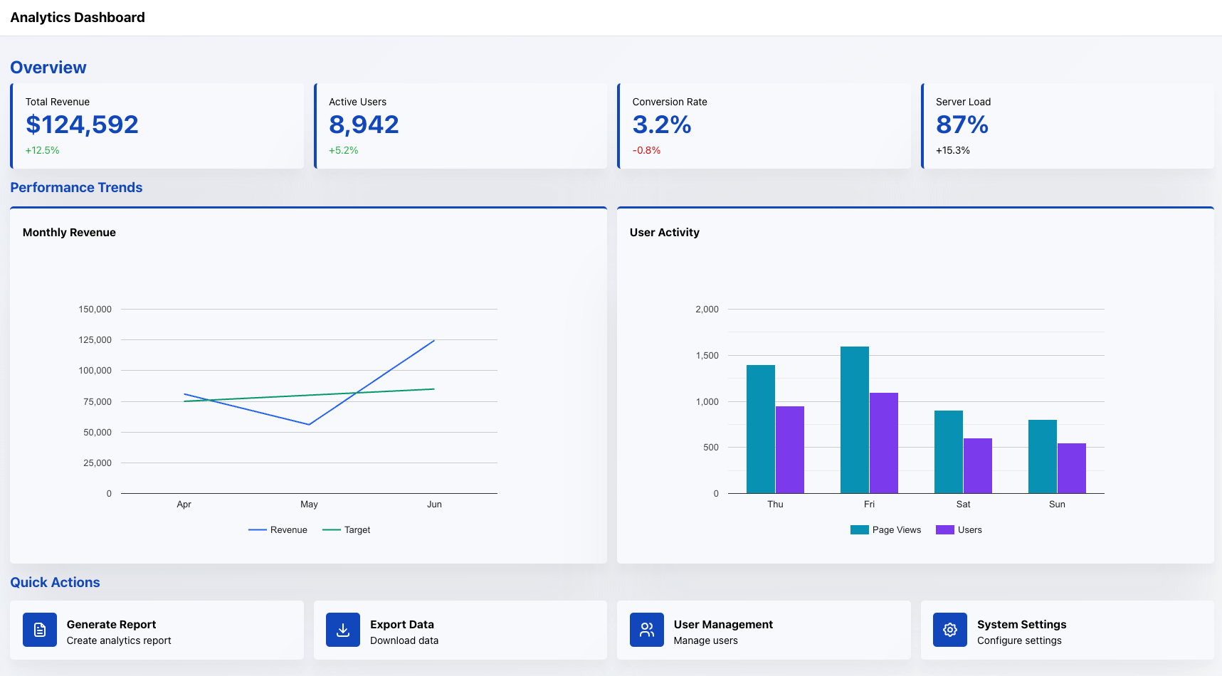
This dashboard shows how all the pieces work together in practice. The responsive layout uses CSS Grid with custom media queries for mobile optimization. All the colors and spacing come from DWC tokens, so changing the primary color at the root level updates the entire interface. The combination of external CSS and inline component styles keeps everything maintainable, which is great because I definitely needed to go back and fix things multiple times.
Wrapping it up
From simple to complex, webforJ's styling system scales nicely. @StyleSheet and @InlineStyleSheet annotations work exactly as expected when you start out. Because the DWC design system handles your colors and spacing decisions, you're not reinventing basic design patterns every time.
The foundation stays the same even when you need something more sophisticated. While DWC tokens keep handling your core styling, you can layer custom media queries and responsive layouts on top. Everything updates consistently across the entire app once you change the primary color at the root level.
Whether I'm building a simple component example or putting together something more complex like that dashboard above, the same approaches apply. No surprises.
Check out the CSS Variables, Themes, and Shadow Parts docs for more information if you want to dive deeper.