Figma design kit
Design with the same tokens your app runs on
The DWC Design Kit is the official Figma resource for designing webforJ apps, so designers and developers work from the same tokens and components.
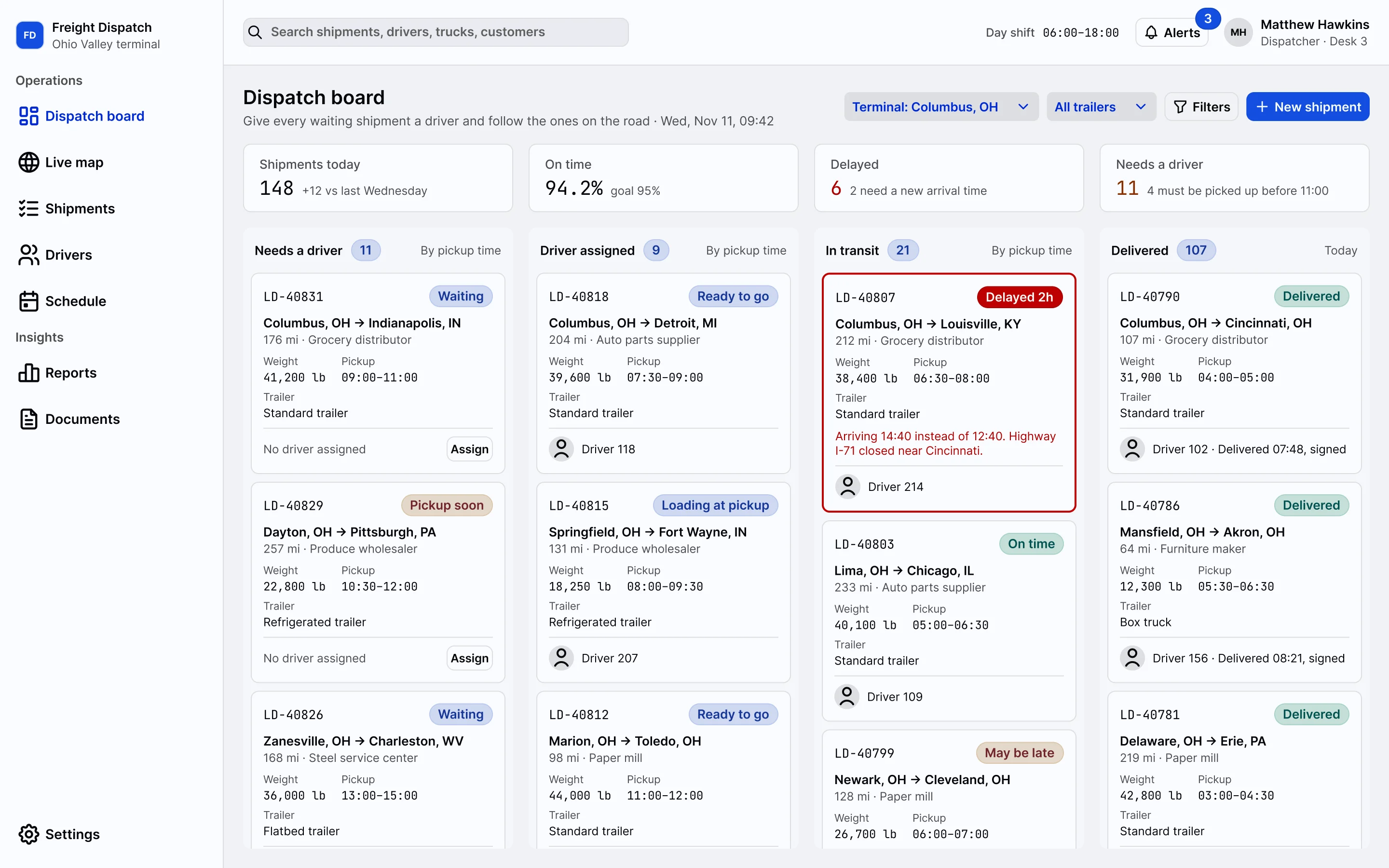
1 of 21Freight DispatchDispatch board
- Components
- Every DWC component, with its themes, expanses and states
- Tokens
- Palettes, typography, spacing and shadows as Figma variables and styles
- Modes
- Light and dark, as the app renders them in webforJ 26 and later
Variables
The values in the kit are the values in the code
The kit holds the DWC tokens as Figma variables. In the app they are CSS custom properties. Everything below is drawn from the --dwc-* variables this page runs on, with the value the browser resolves for each. Switch the site to dark mode and they follow, the way the kit's dark mode does.
Color
--dwc-color-{palette}-{step}Seven palettes of 19 steps, each generated from one seed. Step 5 is always the darkest and step 95 the lightest. Pick a swatch to inspect it.
- Token
--dwc-color-primary-50- Resolved value
- Text on it
--dwc-color-on-primary-text-50
Typography
--dwc-font-size-{size}A size scale in rem, where m is the standard size most components use, and a weight scale from thin to black.
--dwc-font-size-3xsAssign driver--dwc-font-size-2xsAssign driver--dwc-font-size-xsAssign driver--dwc-font-size-sAssign driver--dwc-font-size-mAssign driver--dwc-font-size-lAssign driver--dwc-font-size-xlAssign driver--dwc-font-size-2xlAssign driver--dwc-font-size-3xlAssign driver
- Ag
thin - Ag
lighter - Ag
light - Ag
normal - Ag
medium - Ag
semibold - Ag
bold - Ag
bolder - Ag
black
Spacing and sizing
--dwc-space-{size} --dwc-size-{size}Space sets the room between components. Size sets the width and height of components, with m the standard for almost all of them. The space bars are drawn at four times their size.
--dwc-space-3xs--dwc-space-2xs--dwc-space-xs--dwc-space-s--dwc-space-m--dwc-space-l--dwc-space-xl--dwc-space-2xl--dwc-space-3xl
3xs2xsxssmlxl2xl3xl
Radius
--dwc-border-radius-{size}Every step scales from one seed, --dwc-border-radius-seed. Change the seed and the whole radius system follows.
2xsxssmlxl2xl3xl4xl
Shadows and surfaces
--dwc-shadow-{size} --dwc-surface-{level}Shadows show what is layered on top. Three surfaces organize the hierarchy, from the page to the dialog. Both adapt to light and dark mode.
xssmlxl2xl
--dwc-surface-1Page and body background--dwc-surface-2Toolbars, menubars, cards--dwc-surface-3Windows, menus, popovers, dialogsFrom kit to app
Designed with the kit, built from webforJ components
The screens at the top of this page were designed with the kit. A screen designed with the kit uses the components and tokens the app renders, so the step from mockup to Java code does not translate one visual language into another.
Step through the showcaseDesigner and developer
One handoff, mapped once
Tokens are the contract between design and code. A designer hands over a brand color and a type scale from the kit. The developer maps them to a seed and a font size token once, and every screen inherits them.
- In FigmaA brand colorIn code
--dwc-color-primary-seedAll 19 steps of the palette are generated from it. - In FigmaA type scaleIn code
--dwc-font-size-{size}Sizes in rem, m is the standard. - In FigmaA spacing rhythmIn code
--dwc-space-{size}Room between components, in rem. - In FigmaLight and darkIn code
@AppTheme("system")Follows the OS preference.
In the kit
- Every DWC component as it looks in webforJ 26 and later, with its themes, expanses and states.
- The color palettes, typography, spacing and shadow tokens as Figma variables and styles.
- Light and dark mode for the components and the tokens.
- Precise spacing and accessible color contrast, for interfaces with predictable component behavior.
In the app
Set the brand once as a seed. Buttons, links and focus rings pick it up because they use the primary palette.
:root {
  --dwc-color-primary-seed: #2563eb;
}

html[data-app-theme="dark"] {
  --dwc-color-primary-seed: #a855f7;
}
Register a light and a dark theme and let webforJ follow the user's operating system.
@AppTheme("system")
@AppLightTheme("light")
@AppDarkTheme("dark")
class MyApp extends App {
  // app code
}
Build with AI
From the Figma frame to the Java screen
Connect two MCP servers to your coding assistant, the one from Figma and the one from webforJ. One reads the design, the other knows the framework, and the assistant works between them.
- 01Figma MCP server
Reads the design
It hands your assistant the frame you point at: its layout, its components and its variables. The variables in the kit carry the DWC token names, so the design already speaks the language of the code.
var(--dwc-space-s) - 02webforJ MCP server
Checks it against webforJ
It answers from the real framework: which component to use, what its styling surface is, and whether every token in the CSS exists.
styles_validate_tokens - 03Your assistant
Writes the screen in Java
With both connected, it builds the view from webforJ components and the same tokens the designer used, and you review the result against the frame.
OrdersView.java
Build this Figma frame as a webforJ view. Read the frame with the Figma MCP server, pick the components with the webforJ MCP server and validate every --dwc-* token before you finish.
Get the kit
Start your next screen in Figma
The DWC Design Kit is on Figma Community. webforJ is the full-stack Java framework for business web apps: you build the whole app, screens included, in Java.
- 1Open the kitFind the DWC Design Kit on Figma Community.
- 2Design the screensUse its components and variables, and check every screen in light and dark mode.
- 3Build them in JavaUse the same components in webforJ and set your brand with one seed.
Read the design system
Back to the docs home- Styling overviewThe DWC design system and the kit.
- ThemesThe light, dark and dark-pure themes, and how to override them.
- ColorsSeven palettes, 19 steps each, from one seed.
- TypographyFont family, sizes, weights and line heights.
- Sizing and spacingThe rem scales for size and space.
- BordersWidths, colors and a radius scale from one seed.
- ShadowsSix steps that adapt to light and dark.
- SurfacesThree levels for the UI hierarchy.
- CSS variablesHow tokens are set and overridden.