Styling
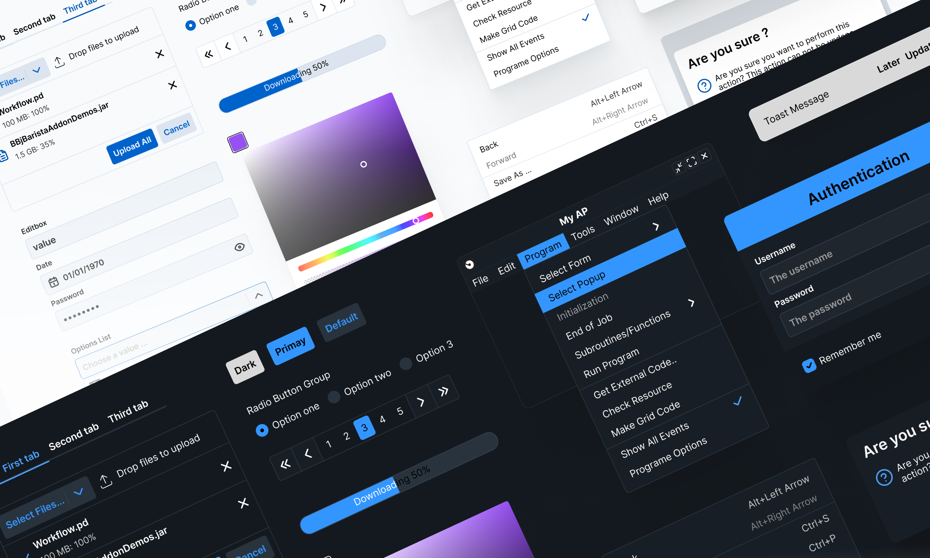
webforJ ships with a comprehensive design system named DWC. It’s more than just a theme, it’s a structured, extensible system that governs the visual language of your app. DWC is built to help developers and designers create consistent, brand-aligned interfaces quickly and confidently.
At its core, DWC provides a set of carefully designed CSS variables (design tokens) that cover key visual elements like colors, typography, borders, and spacing. These tokens serve as the foundational building blocks for all component styles and allow global customization with minimal effort.
To support more advanced styling, webforJ leverages CSS Shadow Parts, allowing component internals to be selectively styled without breaking encapsulation. This gives teams fine-grained control over how components appear, even across larger applications.
DWC also includes a customizable color palette and defaults to a clean, light visual theme, but every aspect can be adapted to your brand or product style.
The webforj-styling-apps skill can theme and style webforJ apps with DWC design tokens. After installing the webforJ AI plugin, ask your assistant:
- "Theme this app with a blue palette."
- "Style the dwc-button to match the brand guidelines."
- "Make this layout tighter - adjust spacing and typography."
Figma design kit
The DWC Figma library is the official design resource for creating modern, enterprise-grade web applications. It includes a comprehensive set of components, typography styles, and color tokens that align with the DWC design system. Designers and developers can use this library to build visually consistent, user-friendly interfaces with predictable component behavior, precise spacing, and accessible color contrast.
Topics
CSS Variables
Define, scope, and consume CSS custom properties to control webforJ component styling at runtime without preprocessors.
Shadow Parts
Reach into webforJ component shadow DOM with the CSS ::part() selector to style internal elements while preserving encapsulation.
Themes
Apply built-in light, dark, and dark-pure themes with @AppTheme or define custom themes through data-app-theme selectors.
Colors
Configure DWC color palettes through hue and saturation seeds that generate consistent shades for primary, status, and neutral tones.
Typography
Tune font family, size, weight, and line height across webforJ apps with the DWC typography CSS custom properties.
Sizing and Spacing
Apply a consistent component sizing and spacing scale across layouts using DWC rem-based size and space CSS variables.
Border
Control component border width, style, color, and radius scale through the DWC border CSS custom properties.
Shadows
Layer elements with the DWC box-shadow scale from xs to 2xl, with shadows that adapt automatically to light and dark modes.
Surfaces
Layer UI hierarchy with three mode-aware DWC surface tokens for page backgrounds, cards, and popovers or dialogs.
State
Style interactive component states with DWC tokens for disabled opacity, focus ring color, and press-feedback scales.
Transitions & Easing
Animate UI changes with consistent DWC duration tokens and cubic-bezier easing curves for natural-feeling transitions.
Styling languages
Author your styles in CSS, compile them from Sass or Less, or generate them with Tailwind, and load the result into a webforJ app.