Card component in Java: build dashboard cards with webforJ

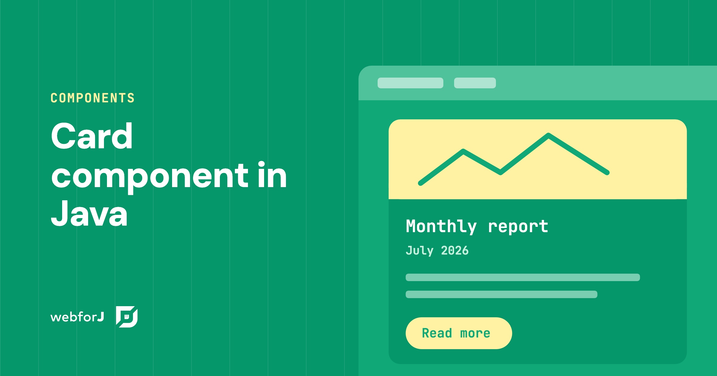
Dashboards live or die by their cards. When every tile has the same frame, the same spacing, and a clear title, the page reads at a glance. When each one is hand-built, the layout starts to drift.
A card component in Java solves that with webforJ: one Card groups related content and actions into a single surface, and you fill its regions from Java. Let's walk through it, from one fully dressed card to a row of them, then tune the shadow, the frame, and the click behavior.
What a card is made of
A card wraps a body, which is its main content, and a set of optional regions around that body. Each optional region has its own slot, and a slot with no content isn't rendered. An empty footer takes no space, and a card with only a body is a framed block of content.
The regions are:
- Figure: an image, a video, or a chart. It sits ahead of the header in a vertical card.
- Icon: the leading visual in the header row. It accepts any component, such as an
Iconor anAvatar. - Title and caption: the heading, plus a secondary line for a date, an author, or a status.
- Header actions: the end of the header row, usually a button or a menu.
- Footer: the closing row, usually for actions or metadata.
The title also becomes the card's accessible name, because the card announces itself as a region. Use a heading such as H3 for the title so screen reader users can find the card through the page's heading structure.
Build a card with regions
Start by passing the body content to the constructor. The other regions are filled with addToFigure(), addToIcon(), addToTitle(), addToCaption(), addToHeaderActions(), and addToFooter(). Each of these methods returns the card, so you can chain them.
Card card = new Card(new Paragraph("Sales climbed across every region."));
card.addToFigure(new Img("cover.png", "Report cover"))
    .addToIcon(TablerIcon.create("chart-bar"))
    .addToTitle(new H3("Monthly report"))
    .addToCaption(new Paragraph("July 2026"))
    .addToHeaderActions(new Button("Share"))
    .addToFooter(new Button("Read more"));
The body can also be filled after creation with add() or addToBody(), which do the same thing. Use whichever reads better in your code.
Each region is optional, and I'd start with just the body and title, then add the rest only when the content asks for it. A card that shows one number and one label looks cleaner without a figure or a footer.
Arrange cards in a dashboard
Cards are vertical by default. The figure stacks ahead of the header, the body, and the footer. That suits a grid of cards, where each one takes a narrow column. For a row of tiles, place the cards in a FlexLayout.
The class below extends Composite<FlexLayout>, so getBoundComponent() returns the layout itself. The buildInvoice() helper builds each card, and the layout wraps them into a row.
@Route
public class InvoiceView extends Composite<FlexLayout> {
  private final FlexLayout self = getBoundComponent();

  public InvoiceView() {
    self.setWrap(FlexWrap.WRAP).setSpacing("var(--dwc-space-l)");

    Card invoice = buildInvoice("INV-2041");
    invoice.setDivided(true);

    Card compact = buildInvoice("INV-2041");
    compact.setDivided(true);

    self.add(invoice, compact);
  }

  private Card buildInvoice(String number) {
    Card card = new Card(new Span("Total $8,400.00"));

    return card.addToTitle(new H3(number))
        .addToCaption(new Paragraph("Due August 30, 2026"))
        .addToFooter(new Button("Pay", ButtonTheme.PRIMARY));
  }
}
setDivided(true) draws a line after the header and before the footer, which helps when a tile holds dense content. For tighter tiles, setExpanse() controls density: the padding, the gaps between regions, and the size of the title and caption. The default is Expanse.MEDIUM, and smaller values suit tiles that share a screen with other tiles.
So far you have built a card region by region, then reused one helper to produce a row of cards with the same structure. Changing every card later means editing one method, not each card on its own.
Elevation, borders and density
Elevation and the frame are separate settings, so you can combine them as you need:
card.setShadow(Card.Shadow.MEDIUM);
card.setBorderless(true);
setShadow() takes a value from Card.Shadow, which runs from NONE through XSMALL, SMALL, MEDIUM, LARGE, XLARGE, and XXLARGE. The default is XSMALL. setBorderless(true) removes the frame. A flat card uses Shadow.NONE with setBorderless(true), and an outlined card keeps the frame with no shadow.
Dividers are off by default. setDivided(true) draws one after the header and before the footer. If a region holds no content, its divider isn't drawn, so a divided card without a footer shows a single line under the header. I find dividers matter most on flat cards, because no frame does that separating work for them.
For orientation, call setOrientation(Card.Orientation.HORIZONTAL). The figure moves beside the header, body, and footer. A card with no figure looks the same in either orientation, so set it only when the card has an image or chart.
Make a card clickable
Card implements HasElementClickListener, so onClick() gives you a listener that receives an ElementClickEvent. The listener applies to the whole surface, which makes the card one click target:
card.onClick(event -> Router.getCurrent().navigate(new Location("/reports/july")));
Clicks on components inside a card also reach the card. A button in the header actions or the footer fires the card's listener too. Attach a listener to the card when it has one clear action, and keep the buttons inside it for actions the card itself doesn't perform. If a card has several buttons, leave the card without a listener.
Build your first card
Create a project with startforJ, or follow getting started. Then open the Card page, where each region has a live demo, and try them in your own view. Keep the FlexLayout page open for the row arrangement.
Frequently asked questions
Can a card be horizontal?
Yes. Call setOrientation(Card.Orientation.HORIZONTAL) to place the figure beside the other regions. Vertical is the default, and it suits cards in a grid.
Can a clickable card hold buttons?
Yes, but a button click also reaches the card. If the button should run its own action only, leave the card without an onClick() listener. If the card should navigate, keep the buttons for actions that don't change the destination.
Building something with webforJ?
Talk to the team about your project, a migration, or whether webforJ fits.
Keep reading
 Java responsive web app layout: side navigation in webforJBuild a responsive Java web app layout in webforJ with AppLayout, a side navigation drawer that collapses on mobile, AppNav tied to routes and ColumnsLayout.
 Toast notification in Java: show messages with webforJShow a toast notification in a Java web app with webforJ. Use Toast.show, set duration, theme and placement, and keep alerts open until the user acts.
 Making Data Display Less Boring in webforJLearn how to use custom renderers to display rich, formatted content in webforJ tables
