FlexLayouts Part 2: Getting your Flex Items in Order
· 7 minutes de lecture

The webforJ FlexLayout component provides an easy and Java-like way to create CSS Flexbox layouts.
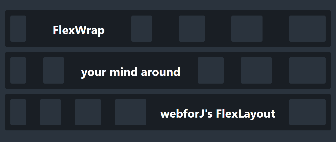
For an introduction, see the first part of this series, FlexWrap your mind around webforJ's FlexLayout, in which I discuss the general benefits of the webforJ FlexLayout component and the methods that modify the flex container.
In this article, I'll dive into the flex items inside the container to see how you can further customize the behavior of your layout.