UI components
Every part of a business screen, ready in Java.
webforJ is the full-stack Java framework for business web apps: you build the whole app, screens included, in Java. Its components cover layout, data entry, dialogs, data display and feedback, and each one is a Java class you create, configure and add to a layout.
- Components in the gallery
- 57
- Typed HTML elements
- 29
- Built-in themes
- 3
- Groups by purpose
- 5
By purpose
Pick a group, then a component. Every tile opens that component's own page in the docs.
Layout
The frame of a screen: app shells, toolbars, flex and column layouts, split panes and surfaces.
8 components

 AppLayoutA structured layout for top-level app navigation and content.

 FlexLayoutArranges its children with flexbox rules for responsive alignment.

 ColumnsLayoutArranges children into columns, useful for forms and grid-like structures.

 ToolbarA horizontal container for action buttons, icons and other controls.

 SplitterDivides space between two components that users resize by dragging.

 AccordionA stacked set of collapsible panels with clickable headers.
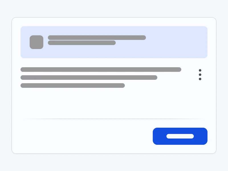
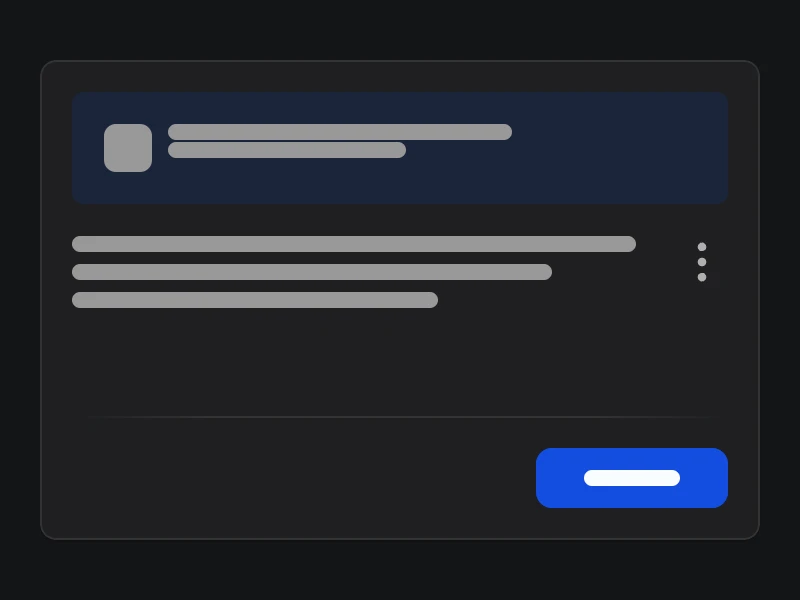 CardA surface with regions for media, headers, body content and footers.

 DialogA modal window that overlays content and prompts the user.
Forms and inputs
Everything a user types, picks or uploads, from text and numbers to dates, masks, lists and files.
20 components

 TextFieldA single-line input for entering and editing text.

 MaskedTextFieldRestricts text to a pattern, such as a phone number.

 NumberFieldA numeric input with controls to step the value up or down.

 MaskedNumberFieldEnforces a numeric format such as currency or percentages.

 PasswordFieldA single-line input that masks password data.

 DateFieldA browser-based date picker in an input field.

 MaskedDateFieldA date input that enforces a defined date format.

 TimeFieldA browser-based time picker in an input field.

 MaskedTimeFieldA time input that enforces a defined time format.

 DateTimeFieldPicks a date and a time in one input field.

 ColorFieldA browser-based color picker in an input field.

 TextAreaA multi-line input for larger blocks of text.

 CheckBoxA binary option that toggles between checked and unchecked.

 RadioButtonSelects one option from a group of exclusive choices.

 SwitchToggles between two states, such as on and off, with a sliding action.

 ChoiceBoxA dropdown list of predefined options.

 ComboBoxA dropdown list combined with an editable text input.

 ListBoxA scrollable list for selecting one or more items.

 SliderSelects a value from a range by dragging a handle along a track.

 UploadAn inline file picker with drag-and-drop, filters and per-file events.
Data and content
Show records, hierarchies, charts and streamed text, and load more as the user scrolls.
8 components

 GoogleChartsCharts and visual data representations through Google Charts.

 TreeHierarchical data that users expand, collapse and interact with.

 InfiniteScrollLoads more items on scroll and tracks when all content is fetched.

 RefresherA pull-to-refresh interaction inside scrollable containers.

 MarkdownViewerRenders markdown progressively, ideal for AI chat and streaming text.

 TerminalA command-line interface inside the app for text-based commands.

 AvatarProfile pictures or initials in different sizes, shapes and themes.

 BadgeA small label for counts, statuses or short metadata.
Navigation and actions
Move between views and sections, page through data and trigger what happens next.
6 components

 AppNavA navigation menu for switching between sections and views.

 DrawerA sliding panel for side navigation or extra content.

 TabbedPaneOrganizes content into tabs that users switch between.

 NavigatorPagination with first, last, next and previous buttons and quick jump.

 ButtonA clickable component that triggers an action when pressed.

 IconA graphical symbol for an action, status or category.
Feedback and dialogs
Tell users what is happening, ask them to confirm, and collect a value, a file or a login.
12 components

 ToastA non-blocking notification that disappears on its own.

 AlertImportant messages or warnings in a noticeable format.

 DesktopNotificationCustom desktop notifications through the browser Notification API.

 ProgressBarA bar that fills as a task makes progress.

 BusyIndicatorAn app-wide indicator that a global process is ongoing.

 LoadingA loading indicator scoped to one parent component.

 SpinnerA rotating animation that shows an action is in progress.

 MessageDialogAn informational message the user acknowledges with OK.

 ConfirmDialogAsks the user to confirm or cancel an action.

 InputDialogPrompts the user for a value with OK and Cancel.

 FileUploadDialogUploads files from the local filesystem to the app.

 LoginA pre-built sign-in UI with username, password and submit.
Composition
Your own components, built from ours.
webforJ uses composition over inheritance. You do not extend a Button. You write a class that extends Composite, combine components inside it, and decide which methods the rest of your app can see.
public class SearchBar extends Composite<FlexLayout> {
  private final FlexLayout self = getBoundComponent();
  private TextField searchField;
  private Button searchButton;

  public SearchBar() {
    searchField = new TextField("Search");
    searchButton = new Button("Go");

    self.setDirection(FlexDirection.ROW)
      .add(searchField, searchButton);
  }
}
One class, one unit.
A
Compositewraps a single bound component and holds your internal structure, so a search bar, an address form or a whole dashboard card becomes one reusable class.You choose the API.
Callers see only the methods you expose, unlike inheritance, where everything is exposed.
Built-in components stay intact.
The built-in components are final, which keeps the web component underneath consistent and predictable. Your behaviour goes around them, not into them.
Beyond the set
Not in the set? Use any component on the web.
The business components are where you start, not where you stop. Every HTML element is a Java class, and any web component can become one.
- 29 HTML elements
The page itself, typed
webforJ ships components that map directly to standard HTML elements, such as Div, Paragraph, the headings, lists, Img and Anchor, with a typed Java API.
HTML components - Web components
Any web component, wrapped
ElementComposite wraps a custom HTML element or a third-party web component and exposes its properties, attributes and events through the Java API.
Element Composite - npm packages
The npm registry, from Java
The frontend bundler turns annotations on a class into compiled frontend assets, so a component can bring the npm package it depends on.
Frontend bundler
Your design system
Have your own design system? Bring it along.
The webforJ components are an offer, not a requirement. If your design system ships as web components, you wrap it once and build the whole app with it, in Java.
- 01
Wrap the components
ElementCompositeturns each custom element into a Java class and exposes its properties, attributes and events through the Java API. - 02
Ship them as one module
The frontend bundler lets a class declare the npm packages it needs, so the wrappers carry their design system with them. An app only adds the dependency.
- 03
Build the app as usual
Routing, security and data binding work the same. A wrapped component that implements
ValueAwarebinds to your model like any built-in field.
Your screens keep the look your company already designed. The framework underneath is still webforJ.
Used from Java
A component is an object you create with new.
You set its state with typed methods, listen to its events with lambdas and add it to a container. The screen is Java code, with no template to keep in sync.
FlexLayout container = new FlexLayout();

container.add(new Button("Click Me"));

TextField nameField = new TextField("Name");
TextField emailField = new TextField("Email");
Button submitButton = new Button("Submit");

container.add(nameField, emailField, submitButton);
// Reveal an additional field when a checkbox is checked
TextField advancedField = new TextField("Advanced setting");
advancedField.setVisible(false);

CheckBox enableAdvanced = new CheckBox("Show advanced settings");
enableAdvanced.addValueChangeListener(e -> advancedField.setVisible(e.getValue()));

// Enable a button only when the required field has a value
Button submitButton = new Button("Submit");
submitButton.setEnabled(false);

TextField nameField = new TextField("Name");
nameField.addValueChangeListener(e -> submitButton.setEnabled(!e.getValue().isBlank()));
Theming
One design system behind every component.
webforJ ships with a design system named DWC. Its CSS variables, the design tokens, cover colors, typography, borders and spacing, and every component reads them. Change a token and every component that uses it follows.
The same field, buttons, switch, badge and progress bar in the light theme.
lightThe default. Light background, subtle primary-color tint.The same field, buttons, switch, badge and progress bar in the dark theme.
darkDark background, subtle primary-color tint.Three themes built in
light, dark and dark-pure, which drops the primary tint for pure neutral grays. Switch at runtime with App.setTheme(), with no rebuild.
Follows the operating system
Register a light and a dark theme and pass "system". webforJ picks the one that matches the user's preference and switches again when it changes.
@AppTheme("system")
@AppLightTheme("light")
@AppDarkTheme("dark")
class MyApp extends App {
  // app code
}
Rebrand with a few tokens
Override the seed tokens of the built-in themes and every component picks up the new look. Shadow parts reach inside a component when a token is not enough.
:root {
  --dwc-color-primary-seed: #6366f1;
  --dwc-font-size: var(--dwc-font-size-l);
}
The gallery
Open the gallery and see all 57.
The gallery in the docs lists every component with its preview and a short description, in the same four sections the docs use.